
Utilizing the FRED API: Part 1
Extracting and analyzing the most up-to-date data from the Federal Reserve.

Introduction
The FRED API is a powerful tool for anyone looking to dive deep into economic data and trends. Whether you’re tracking inflation, unemployment rates, or any number of macroeconomic indicators, the St. Louis Fed provides a vast swath of data that can be quite useful. Additionally, the FRED API provides direct access to said repository and can be a quick and efficient way of doing in-depth analysis.
Helpful Hint: Most of the data found on the St. Louis Fed’s website is great. However, just because it’s the fEdErAl rEsErVe doesn’t mean that everything they produce is A) correct and B) useful/impactful. And if you don’t believe me, when you finish this article look up this code: QTAXT99QTAXCAT3VTNO
By integrating this API into your projects, you can automate data retrieval, build visualizations, and perform complex analyses to gain insights that would otherwise require manual collection and manipulation. In this post, we’ll explore how to use the FRED API to pull in key economic series, visualize the data, and use it to inform your research or business decisions.
Build a few functions to import a 'series' - which is basically a column of data. Once you have data, now you have to turn it into insight. Anyone can look at data, but you have to look into what it's telling you. For example, looking at the value of the M2 money supply might not tell you anything. Looking at the year-over-year delta might. Looking at the velocity of which it is changing (growing!) can also be insightful, perhaps.
Code
import pandas as pd
from fredapi import Fred
import datetime
from pandas.tseries.offsets import BusinessDay
import matplotlib.pyplot as plt

fred = Fred(api_key=' INSERT YOUR API KEY HERE  ')

###   SERIES GROUPS
money_supply = ['M1', 'M2', 'M1V', 'M2V']

###   DATA FUNCTIONS
def get_fred_data(series_group):
    data = pd.DataFrame()

    for series in series_group:
        series_data = fred.get_series(series)
        data[series] = series_data
    return data

def visualize_data(data, title):
    data.plot(figsize=(10, 6), title=title, grid=True)

def save_to_excel(data_dict, filename):
    with pd.ExcelWriter(filename) as writer:
        for sheet_name, data in data_dict.items():
            data.to_excel(writer, sheet_name=sheet_name)

###   DATA
moneySupply = get_fred_data(money_supply)

###   VISUALIZATIONS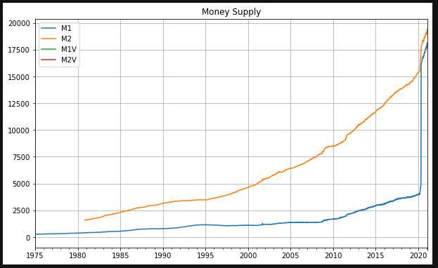
visualize_data(moneySupply, 'Money Supply')Results
Analysis
During the first two years of the COVID-19 pandemic, the M2 money supply surged by more than 40%, a massive increase that coincided with the highest inflation rates seen in four decades. Following this spike, the M2 measure began to decline, and, notably, inflation also started to decrease rapidly. At first glance, this could be seen as a simple correlation, but it raises an important question: could the trajectory of the money supply have been a predictor of inflationary trends, offering valuable insight into future price movements?
This connection between M2 and inflation suggests that monitoring the money supply might be a useful tool for the Federal Reserve in forecasting inflation trends. The direct relationship between money supply growth and inflation isn't just a theoretical concept; it is grounded in economic theory and historical data. However, the question remains: were there better metrics or indicators that could have predicted inflation more accurately during the pandemic era?
If there were alternative measures that proved more reliable, why weren’t they utilized before the inflationary surge, or why did they not receive more attention when inflation was widely dismissed as "transitory"? This prompts a closer look at the tools and metrics we use to track economic shifts, and whether our reliance on certain indicators has been sufficient, or if broader or more timely measures could have provided earlier signals. The ongoing challenge for economists and policymakers is to identify the most predictive and timely indicators, ensuring that tools like M2—and perhaps others—are utilized effectively in understanding future inflationary trends.
Conclusion
There’s a ton of good (and free!) data on the web. Go find it and make it work for you. In this case, now you know why inflation got so hot so fast.